The design concept and main functions of nteract data explorer
Editor's note: Elijah Meeks, Netflix data visualization engineer and author of "D3.js in Action", introduced the design concept and main functions of the nteract data explorer.
Most of my career has been spent on designing and creating data products-analysis applications such as data panels, which facilitate the understanding of algorithms and data visualization prototypes of data sets. A considerable part (but still not too much) of time is spent developing a React data visualization framework called Semionic, which is used in the graphics part of many of my other data products.
If you are only interested in the features of nteract data explorer, you can skip the following sections and start reading directly from how to use data explorer.
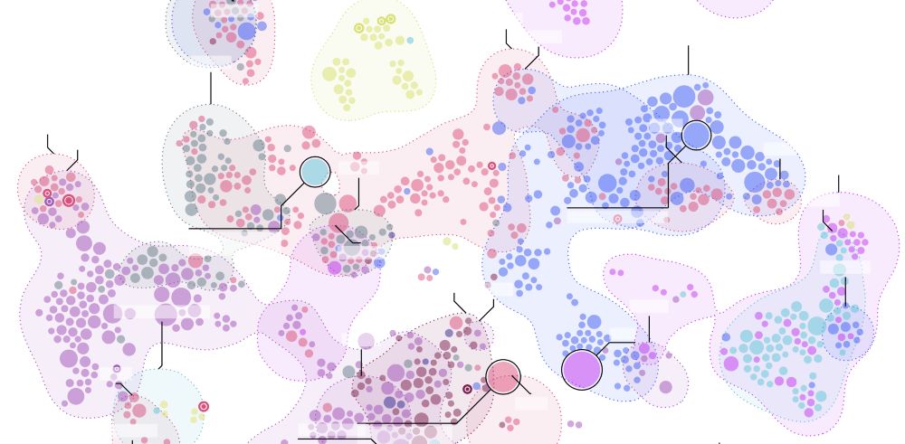
Visualizing TSNE dataset based on Semiotic by Susie Lu
There are two main areas of data visualization: applications and tools. In the context of data visualization, tools refer to software libraries such as D3, or platforms such as Tableau. These visualization tools allow you to create data products, such as panels or reports. However, there is another area of ​​data visualization that I haven't touched much before: automatic data visualization. So when I was developing a data explorer for the nteract platform, I was very excited and wanted to see what I could contribute to this important area of ​​data visualization.
Problem space
Insert a table or other structured data set, and then cycle through different views, this is automatic visualization. For example, insert a table, and then you can view its column chart or pie chart, hoping that different views can reveal what is hidden in the data.
In a sense, all data visualization for exploratory data analysis has an automatic mode. Business intelligence (BI) tools like Tableau allow you to design panels and reports by experimenting with different views. ggplot2 accepts the desired data structure and returns beautiful default graphics, allowing you to cycle through the views relatively easily.
The difference between the above tools and nteract data explorer is that the data explorer is not designed for the final report or panel generation. Instead, it only provides a set of graphs that allow you to get an overview of the data in the notebook. Notebook users have various ways to create data visualization final products, and they know what they want to present and emphasize. Data Explorer has no intention to compete in this area.
the goal
Summarize the data in an appropriate way. You can compare not only individual rows, but also grouped rows to highlight distribution and hierarchy.
Support diverse data views. For example, line graphs and histograms are great for depicting the numerical measures of different rows, but they are completely useless when visualizing edge lists. Similarly, if you need to view a large number of data points, you will want to see the correlation density of two measures, rather than the distribution of a single data point.
Encapsulate components for reuse by other query interfaces. For example, the same visualization component can be used in Netflix's internal SQL query application.
The data explorer uses the tabular data resource representation implemented by pandas. This is a simple data format, which includes:
Column name and column type (string, number)
dataframe key
Multiple measures
Tabular data structure
In addition, the data scale for which the data explorer is designed is hundreds of data points, not thousands or even more data points.
Why is based on Semiotic
It happened that I was developing this charting framework based on the structured view of the data model and the data visualization method. Unlike other icon libraries, Semiotic does not have components such as (bar chart) or (pie chart). In contrast, Semiotic uses frames to represent data visualization methods shared by different data structures. Semiotic includes three types of frames:
, Used for histogram, summary graph, parallel coordinate graph
, Used for scatter chart, line chart, hexbin chart
, Used for force-oriented network, Sankey diagram, hierarchical structure diagram
Semiotic's design approach means that it is fairly easy to implement a variety of charts. For example, it can be used not only to display force-oriented networks, but also to display many different topology-oriented icons, including dendrogram, rectangular tree diagram, Sankey diagram, and circle packing.
How to use data explorer
We will use the World Happiness Report as a sample data set. You can try it yourself in nteract or browse online through mybinder (it may take 30 seconds to load the notebook):
https://hub.mybinder.org/user/nteract-examples-6lbp5cij/nteract/edit/python/happiness.ipynb
Configure the following in the notebook to use the data explorer:
import pandas as pd
pd.options.display.html.table_schema = True
Load the data and then view the dataframe:
df = pd.read_csv(
"https://gist.githubusercontent.com/rgbkrk/a7984a8788a73e2afb8fd4b89c8ec6de/raw/db8d1db9f878ed448c3cac3eb3c9c0dc5e80891e/2015.csv"
)
df

As shown in the figure above, some icons appear on the right side of the dataframe. Click these icons to switch between different data visualization modes.

Bar graph, summary graph, scatter graph, hexbin, network graph, hierarchical structure graph, parallel coordinate graph, line graph
Histogram
The first mode is a histogram. Each column can be interactive. However, for clarity, only the bars with the highest values ​​are colored. Through the Metric drop-down menu, you can specify a different measure as the vertical axis.

Rows can be aggregated through Categories (categories). WIDTH (column width) can also be used to encode the second measure to generate a histogram of unequal widths.
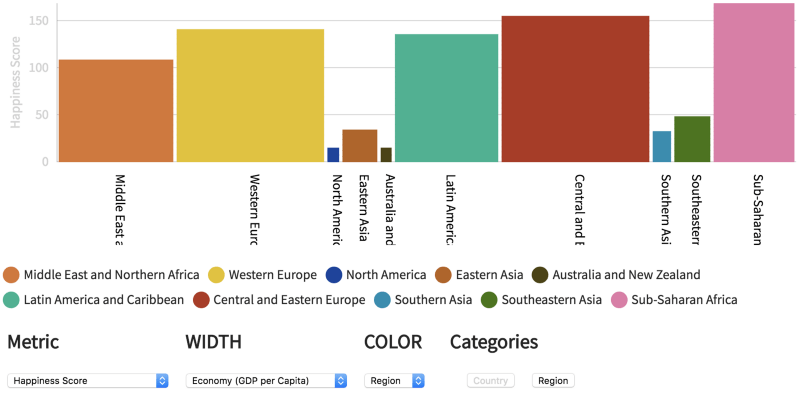
It should be noted that the aggregation is only a simple addition, so when a Region is selected, the total value of happiness in the region is obtained, that is, the more countries in the region, the higher the happiness in this region. . If we want to accurately compare the happiness of different regions, we should use a summary chart.
Summary chart
The icons below the bar graph correspond to the summary graph. The violin graph is used by default, and the data points can be viewed by hovering the mouse over the data points.
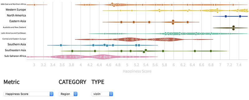
In addition to Metric (measurement) and CATEGORY (category), you can also change the TYPE (visualization type): joy plot, box plot, heat map, histogram.
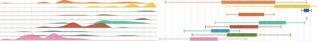
Left: joy plot; right: box plot
Scatter plot
The third mode is a scatter chart, which provides the option of size coding (if you think you need to create a bubble chart). In addition, the value of a single data point can also be viewed by hovering the mouse. The scatter plot also provides preliminary annotations for the top data points.

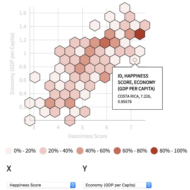
hexbin
Below the scatter plot is the hexbin icon. hexbin helps to explore the density of larger data sets. Hover the mouse to view the aggregated data points.
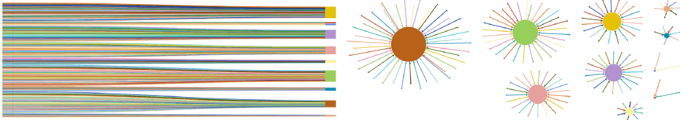
Network Diagram
The nteract data explorer supports two types of network diagrams: Sankey diagram (showing flow direction) and force-oriented network (traditional SNA-like method). Unfortunately, on non-network sample data, the effects of these two graphs are very poor.
Hierarchy diagram
Next is the hierarchical structure diagram for you to explore the hierarchical structure model. Use the Categories button to choose how to nest the data. In treemap or partition mode, the selected Metric will be used to specify the size in the visualization.

Parallel coordinate graph
Parallel coordinate graphs allow you to analyze data interactively, filtering the data through the brushes on each column. Click the Explore/Filter button to switch between exploration and filtering modes. In the filter mode, you can filter the data by adjusting the start and end of the brush (zoom size and moving position). In the exploration mode, hover the mouse to view individual data points.

line chart
Through the line chart mode, you can view the combination of measures, as well as their appearance in the form of percentages and aggregations. In the future, I will upgrade this model and apply corresponding visualization when the data contains timing information or sequence information.

Follow-up improvement
Improvements in the data model
The flexibility of charting technology is just one of the many constraints of automatic data visualization. The current data explorer provides many possible views of the data, but there is no hint at all about which one you should use. Using a more robust data model can improve this:
Cardinality: Providing cardinality information helps determine whether the string is something like a name (high cardinality) or category (low cardinality).
Preprocessing: Automatic data visualization processes tabular data, but using this format to represent specific types of data is a challenge. Better storage of time series data, summary sketches of data, and topological data help to visualize data methods and explore data methods with better robustness.
Features: Simple annotations in the scatter chart view are the main features of Semiotic. However, it is difficult to automatically generate comments. Heuristic algorithms that explore data features, such as anomaly detection or other methods, can add rich annotations to data visualization.
Improvements in data explorer
This is my first attempt to create some kind of automated data exploration tool, and I am sure there is room for improvement. So I welcome everyone who uses nteract to submit bug reports or request development of new features. I personally think that the following three aspects are worthy of improvement:
UI improvements: One of the requirements for developing data explorers is to use native HTML controls. It wasn't until I tried to use only native elements to achieve a beautiful and comprehensive UI that I realized how much I rely on custom UI elements. In addition to the improvement in aesthetics, many controls can be better designed, such as buttons that can provide more built-in instructions. In particular, the navigation between different views should have a better level of information, prompting users to the degree of relevance of different charting methods.
Multiple small graphs: The most useful visualization technique for exploring data is to juxtapose multiple small graphs-multiple graphs based on the same data and/or the same scale for comparison of different dimensions.
Preservation status: As I mentioned before, the data explorer is not going to compete with traditional notebook data visualization. The view of the data can be saved to the unit to avoid loss after refresh, this function is still useful.
Conclusion
As far as my experience is concerned, current automatic data visualization products tend to be packed with features and lack a unified theme. What I hope data explorer can do is not only provide users with a large number of charts, but also make data visualization and data exploration better match.
Old-fashioned Bluetooth Speaker
For Old-fashioned Bluetooth Speaker, I personally think that when many people buy Vintage speakers, the appearance is the first priority and the function is second.
We focus on retro Bluetooth speakers,It has high energy density, mini size, light weight and diversified shapes;Excellent fast charging performance, support fast charging and other excellent features with a brand-new design, showing retro nostalgia without losing fashion. It uses a 2.5-inch speaker and has many functions such as FM radio, Bluetooth fast connection, multi-mode switching, and HIFI high fidelity. Wireless Bluetooth 4-10 hours of playback (at 50% volume), which adds to its unique charm.
The sound quality of small speakers is also good. It does not have the same large speakers and power as HIFI speakers, and its sound quality cannot compete with large speakers due to physical limitations. But for the vast majority of users who are not golden ears, the use of small speakers with tablets and mobile phones is sufficient to meet their hearing requirment.
Wireless Bluetooth Speaker,Hand Free Bluetooth Speaker,Old-fashioned Bluetooth Speaker, Mini Speaker
Shenzhen Focras Technology Co.,Ltd , https://www.focras.com